Book a call
Organi is a Lisbon-based restaurant known for its organic, seasonal cuisine and minimalist approach to food. As the brand prepared to open a new and expanded venue, the goal was to refine the existing visual identity — preserving its recognisability while elevating its presence to match the new space and concept.
Rather than starting from scratch, the rebrand focused on evolution through precision. Working in collaboration with typographic designer Gil Rodrigues, we corrected subtle structural imbalances in the original logotype and reinforced the brand’s consistency across physical and digital touchpoints. The challenge was to modernise the identity without losing the authenticity that loyal customers already associated with Organi.
The creative process was guided by the essence of the brand: natural sophistication. The moodboard explored textures of wood, stone, and linen — the same materials used in the restaurant’s interior design — paired with earthy greens and warm neutrals that reflect the freshness of the menu.
The typography adjustments brought balance and elegance to the logo. Gil Rodrigues refined letter proportions and kerning to improve readability and optical harmony, while we established a new visual rhythm between the mark and its applications. Together, these adjustments created a stronger visual anchor for the brand’s expansion.
The concept celebrates organic geometry — a blend of precision and imperfection that mirrors the restaurant’s philosophy: mindful, honest, and grounded.


The refined logo maintains its signature simplicity while improving overall proportion and legibility. The identity system is built on two core colours — Organi Green (#014630) and Organi Gold (#C09744) — complemented by soft neutrals to express both nature and sophistication.
Supporting iconography was developed for wayfinding and restaurant signage, using clean geometric forms that echo the letter shapes of the logotype. The signage system was designed for clarity and coherence, ensuring the same sense of calm navigation found in the restaurant’s spatial layout.
The visual system extends across menus, packaging, social media templates, and interior graphics. The tone of communication remains understated — letting the textures, materials, and typography convey the brand’s values. Each application follows a grid-based structure to maintain balance between elegance and restraint.


The rebrand strengthened Organi’s visual coherence and aligned the identity with its evolving culinary and spatial experience. Guests now recognise the restaurant not only by its name, but by a consistent design language that communicates warmth, care, and authenticity.
The refined typography and colour palette translate seamlessly across physical and digital contexts, while the signage and icon system enhanced the overall customer flow within the restaurant. By keeping familiarity at the core, the new Organi identity feels both renewed and timeless — a quiet evolution that honours its origins.
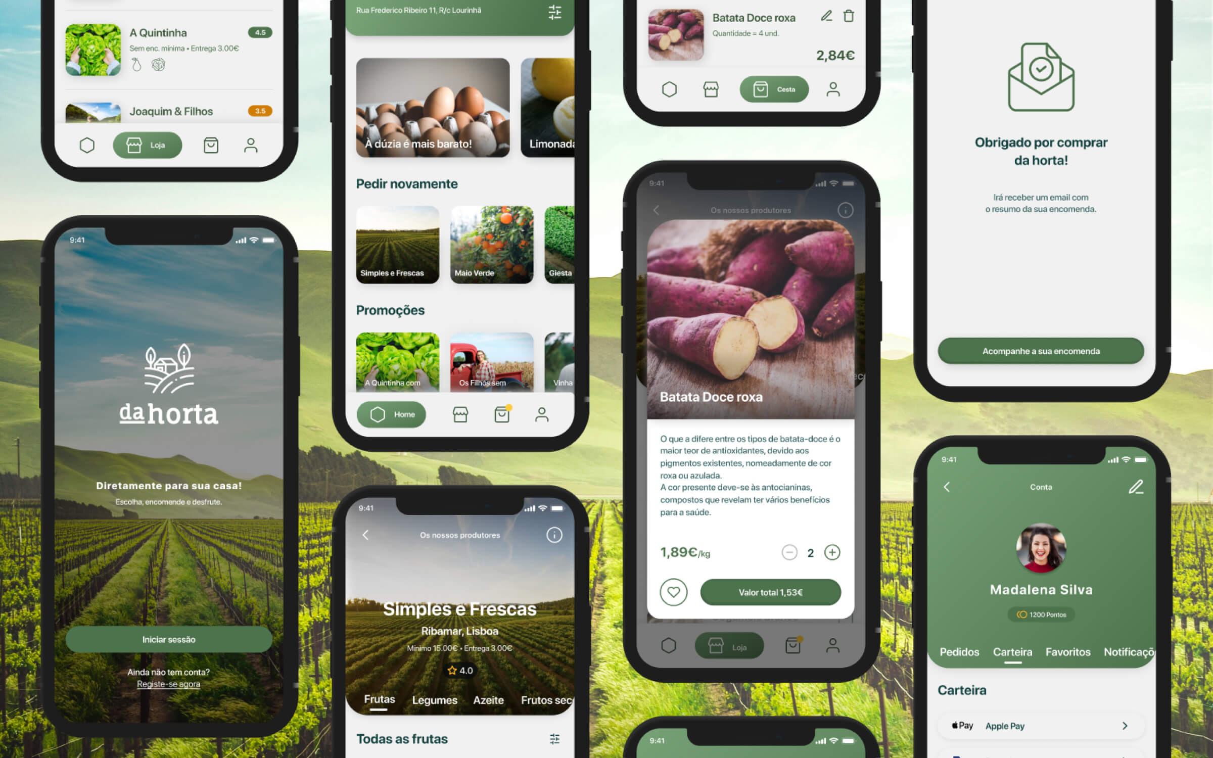
A friendly, clean digital presence for a local farm-to-table initiative, built around transparency, sustainability, and simple interactions.
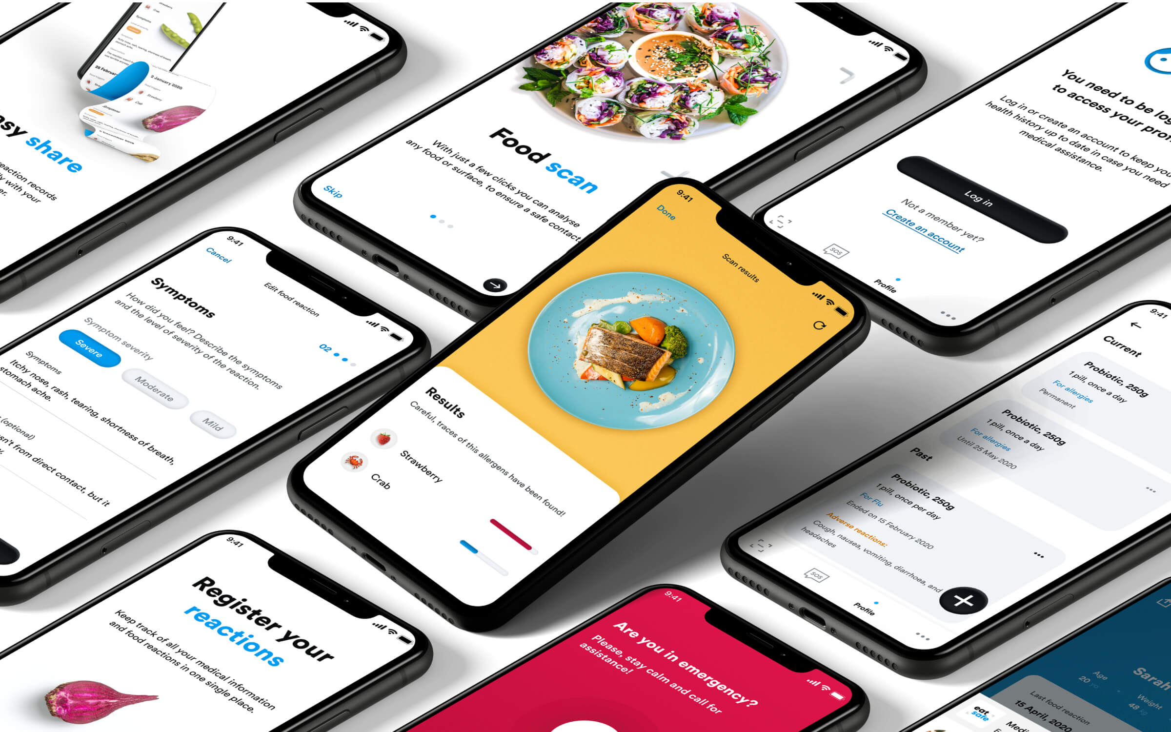
A food-safety app concept helping users scan ingredients, and detect allergens through a health-centred design system.