Book a call

Sushi Club was born during the early months of the pandemic — a bold sushi pop-up concept launched in Fátima, a city better known for its religious sanctuary than its culinary scene. Despite its coastal proximity and access to exceptional fish, there were no sushi restaurants in the area.
The founders envisioned a contemporary brand that could introduce Japanese cuisine to Fátima through a refined yet approachable delivery-only format. They approached us with an initial logo idea, seeking to elevate it into a full brand system — one that could grow beyond a local project and adapt to future locations across Portugal.
The challenge was to blend Japanese tradition with local character, translating the elegance of sushi craftsmanship into a brand language that felt fresh, modern, and scalable.

The visual concept drew inspiration from The Great Wave of Kanagawa, a timeless symbol of strength, craftsmanship, and movement — qualities that mirror sushi artistry itself. Our exploration focused on capturing the harmony between tradition and flow: dynamic yet calm, minimalist yet expressive.
We worked closely with the client through collaborative moodboards that blended Japanese visual cues — brush textures, circle motifs, and wave compositions — with modern graphic minimalism. Typography research led us toward elongated, geometric sans-serifs reminiscent of Japanese signage, combined with a calligraphic script that balanced structure with spontaneity.
The chosen palette preserves the client’s original tones of black and orange, reinterpreted through a muted, earthy red that evokes lacquerware and Japanese ceramics. A warm beige was introduced as a neutral base, bringing softness and contrast to the identity while enhancing legibility across digital and packaging contexts.
The final logo captures the energy of a breaking wave contained within a circular frame — a visual metaphor for controlled artistry. The wordmark combines a textured handwritten “Sushi” with the geometric “Club”, reflecting the balance between tradition and modern hospitality.
A key element of the system is the modular location tag: the name “Fátima” sits within a red sun circle, symbolising both origin and expansion. This flexible structure allows the brand to scale across future openings by simply replacing the location name while preserving the same visual DNA.
The identity extends into a fully branded delivery experience — from packaging and menu design to social content. The custom takeout box features the wave illustration wrapping around its structure, integrating brand storytelling into the product itself. Social media materials were developed for menus, seasonal offers, and event promotions, ensuring consistency in tone and visual rhythm.


The Sushi Club brand established a strong, recognisable identity that elevated the perception of local delivery dining in Fátima. The refined design system allowed the restaurant to stand out as both authentic and contemporary, bridging Eastern inspiration with Western minimalism.
The modular brand structure ensures flexibility for future locations, while the packaging and social assets helped the business build a loyal following during the lockdown period. The design’s clarity and cultural resonance have positioned Sushi Club as a distinctive and scalable brand within Portugal’s growing sushi market.
This project became a testament to the power of design under constraint — proving that even a delivery-only concept can feel immersive, memorable, and crafted with intention.
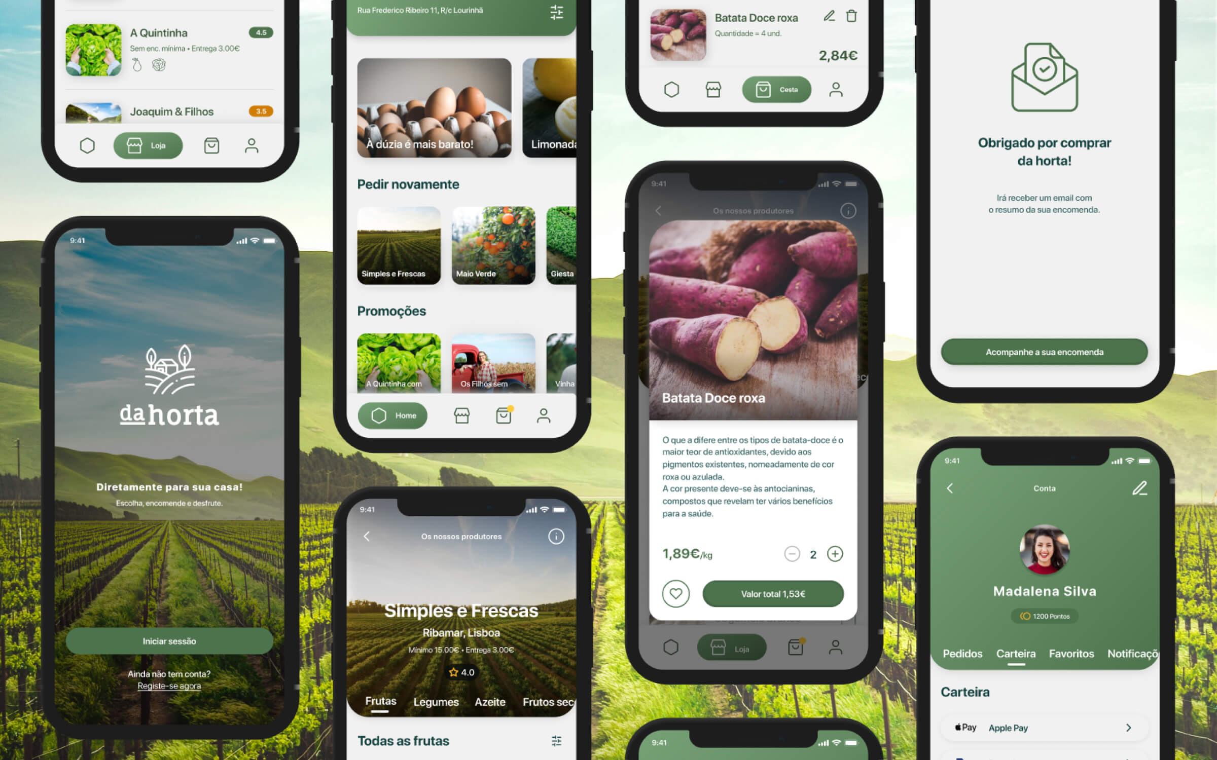
A friendly, clean digital presence for a local farm-to-table initiative, built around transparency, sustainability, and simple interactions.
An AI-assisted platform that supports accountants in navigating complex documents and regulatory frameworks, turning analysis and drafting into a clearer, more controlled workflow — without removing human judgement from the process.
