Book a call
Oaktree Group, an architecture and construction approached us with the need for a unified brand identity — one that could represent both the technical precision of its engineering work and the creative vision of its design practice.
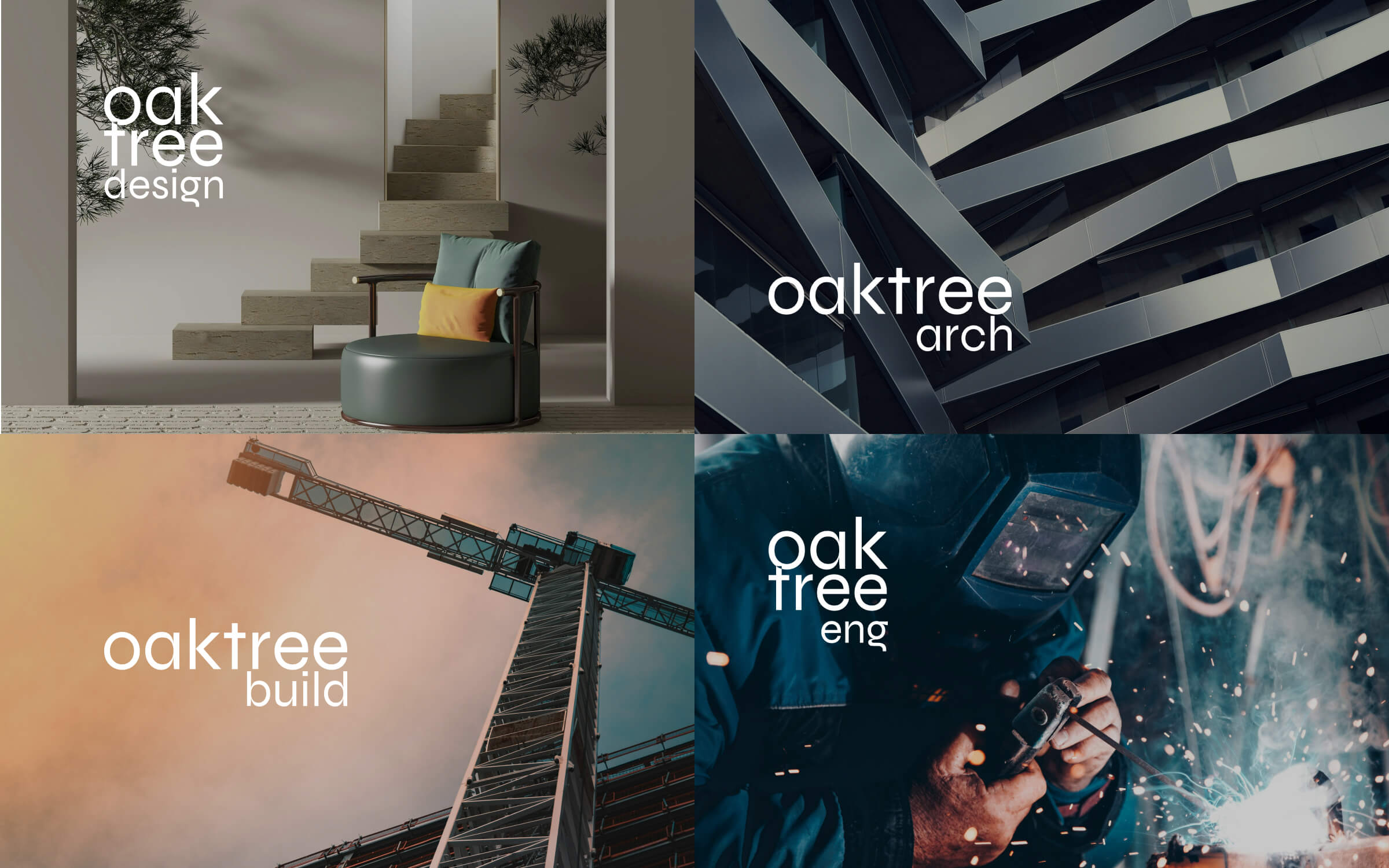
The challenge was to create a brand system that felt solid, grounded, and timeless — a reflection of architectural integrity — while allowing enough flexibility for sub-brands such as Oaktree Architecture, Oaktree Design, and Oaktree Construction and Oaktree Engineering to coexist under one visual umbrella.
The brand concept draws inspiration from the oak tree itself — a symbol of strength, stability, and organic growth. We explored textures, tones, and patterns rooted in nature and materiality: wood, stone, and metal. These elements became visual metaphors for the group’s multidisciplinary foundations.
The moodboard combined earthy tones, structured geometry, and minimalist typography to reflect both craftsmanship and clarity. The creative process started with a collaborative workshop and iterative feedback cycles where moodboards, typographic pairings, and initial mark concepts were refined to align with the client's vision of “strength with warmth.”
The final logo combines geometric precision with natural symbolism. The stylized oak mark — crafted with a subtle grain texture — evokes both wood and architectural drafting, bridging the worlds of nature and construction. Its proportions balance mass and space, creating a timeless visual anchor for the brand.
The color palette builds from Walnut Brown as the core tone, supported by Muted Sage and Stone Grey. These tones translate the materiality of oak, concrete, and metal into a cohesive identity system. Each Oaktree sub-brand adopts a unique accent tone — such as Royal Purple for Design and Steel Blue for Architecture — reinforcing individuality within unity.


The final brand identity positioned Oaktree Group as a contemporary, credible, and human architecture firm. It communicates craftsmanship through restraint — avoiding excess ornamentation in favor of calm, grounded visuals.
The client highlighted the identity’s “organic precision” and versatility, noting how easily the system adapted across the group’s divisions. The color and typography hierarchy enabled a unified yet flexible communication structure, serving as a visual architecture for the brand’s long-term growth.
This project reinforced the power of collaborative design processes — where structured creative direction and authentic storytelling converge to form a timeless visual narrative.
A refined visual identity inspired by craftsmanship and natural materials — elevating a construction and architecture brand with a modern, premium look.
A complex US-mortgage underwriting tool reorganised into clear flows, helping consultants review, validate, and approve applications with confidence.