Book a call

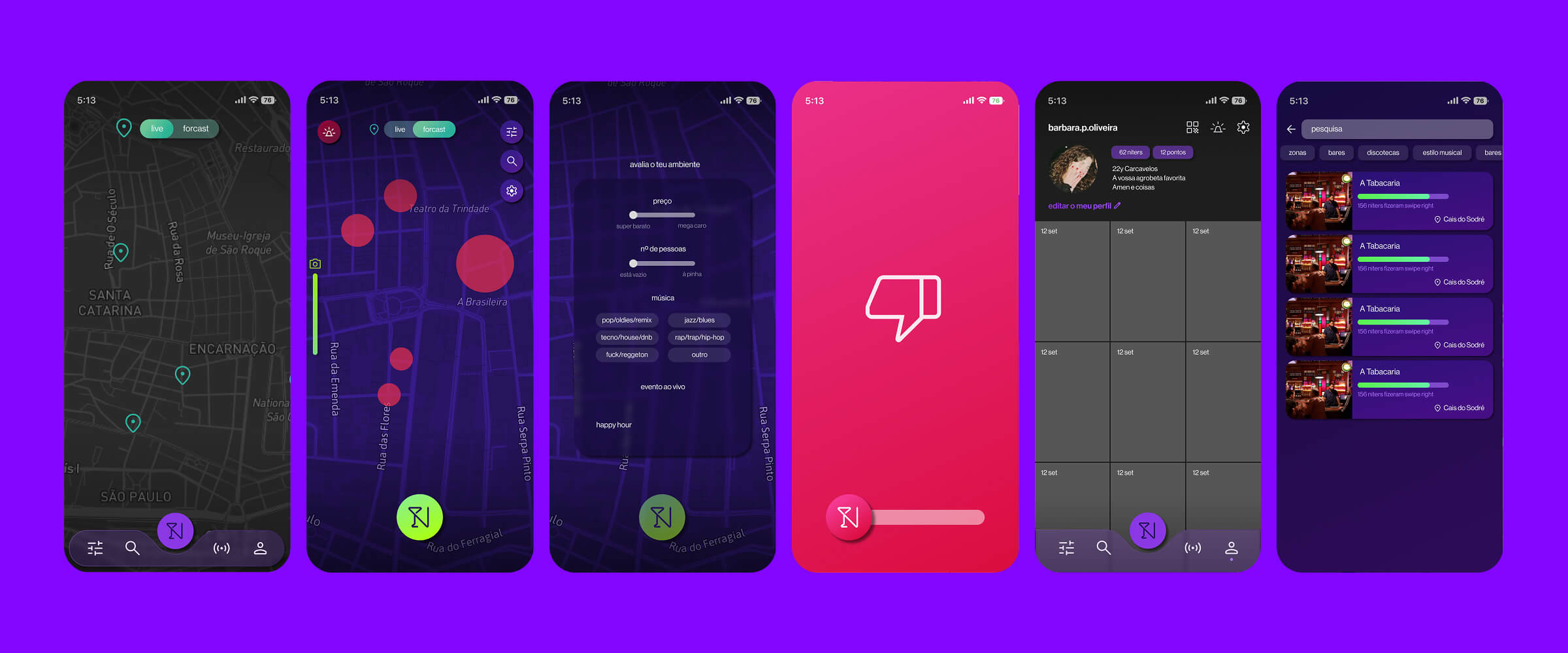
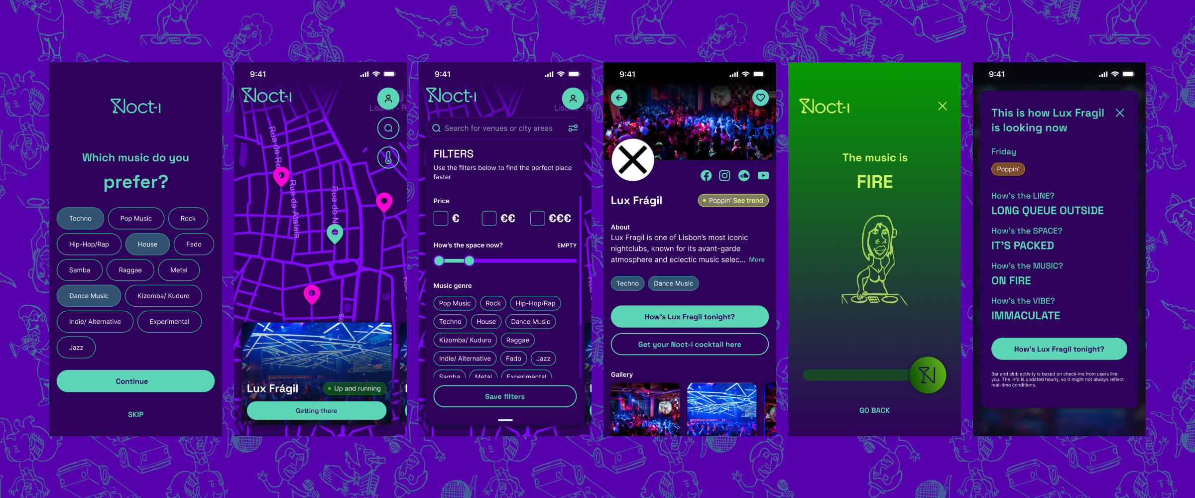
Noct-i is a nightlife app designed to help users understand what's happening in their city—right now. From real-time venue activity to mood indicators and queue lengths, the app transforms fragmented nightlife information into a clear, visual, and trustworthy experience.
The project involved designing the entire MVP ecosystem: map interactions, club pages, voting flows, user accounts, and a modular design system capable of scaling to new cities. All illustrations throughout the app were created by Portuguese artist Manuel Arroteia, giving the interface a unique cultural visual identity.
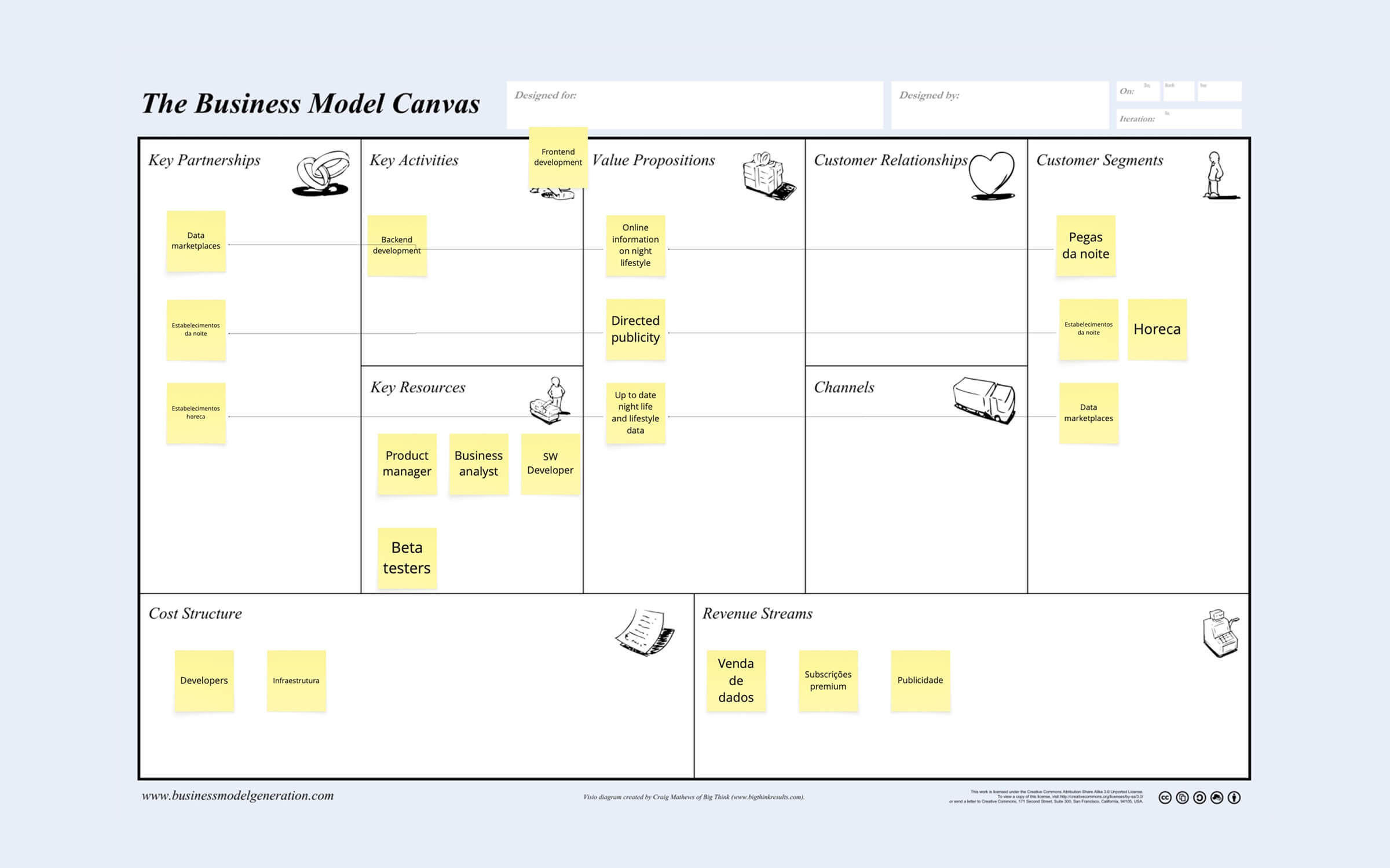
The nightlife market is chaotic: information is scattered across stories, chats, WhatsApp groups, and unreliable online posts. Noct-i needed a way to surface real-time data—vibe, queue, crowd, music, and energy—without already having a large user base. The challenge was to design a product that worked from day one, even with minimal activity, while preparing it for long-term scalability.
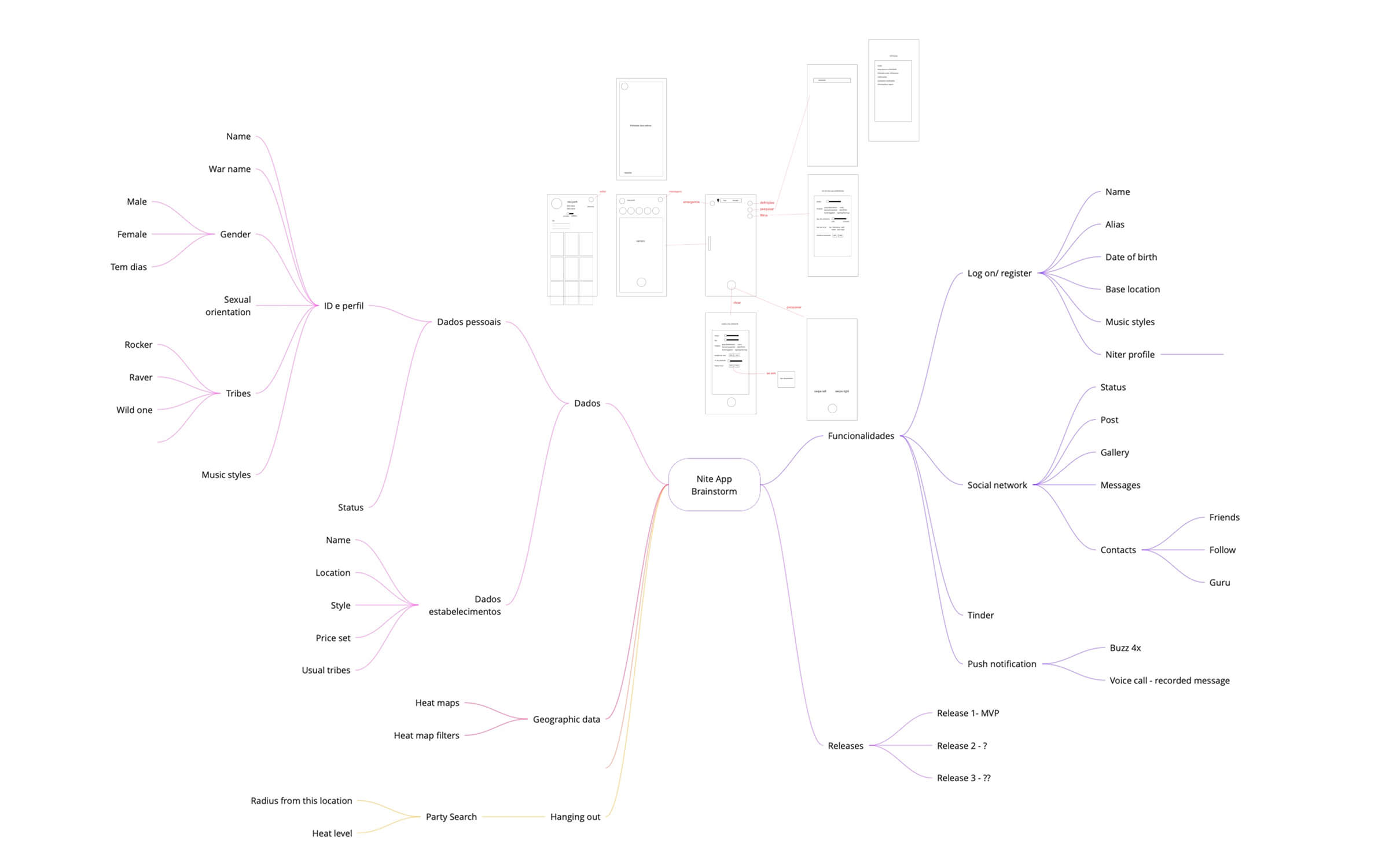
We designed an experience that balanced curated baseline information with community-driven updates. The UX architecture mapped every interaction: scanning the map, selecting venues, voting workflows, behavior states, and profile management. The visual identity leaned into high-contrast nightlife colors, neon-inspired gradients, and hand-drawn illustrations that gave each state emotional clarity.
The final MVP introduced a cohesive nightlife navigation system centered around a dynamic map. Users can browse clubs and bars, see live status cards, open full venue pages, and submit real-time votes on how the place feels. Each venue includes images, hours, affluence data, favorites, and status indicators tied to the illustration system.
A key part of the solution was the visual storytelling layer. All illustrations—representing vibes like PACKED, DEAD, FIRE, BREEZY, and VIBING—were custom-created by Portuguese artist Manuel Arroteia. His playful, edgy style gave each status emotional personality while grounding the product in local culture. By collaborating with a local emerging artist, the UI gained authenticity and visual coherence that resonated with nightlife users.
A comprehensive design system was built: colors, gradients, typography (Space Grotesk + Inter), iconography, badges, map pins, input fields, buttons, and reusable nightlife-specific UI components.

Noct-i evolved from a simple nightlife idea into a fully structured, scalable MVP ready for development and investor presentations. The design system accelerated new feature proposals and enabled a consistent UX across all modules. Early tests with venue owners and nightlife communities showed strong interest in real-time visibility and the emotional illustration system.
The combination of real-time data, map navigation, and emotional illustrations proved essential for user comprehension. Designing for a low-data environment required flexible architecture: pre-populated content, curated states, and mechanics that still feel valuable even with small user adoption.
An AI-assisted platform that supports accountants in navigating complex documents and regulatory frameworks, turning analysis and drafting into a clearer, more controlled workflow — without removing human judgement from the process.

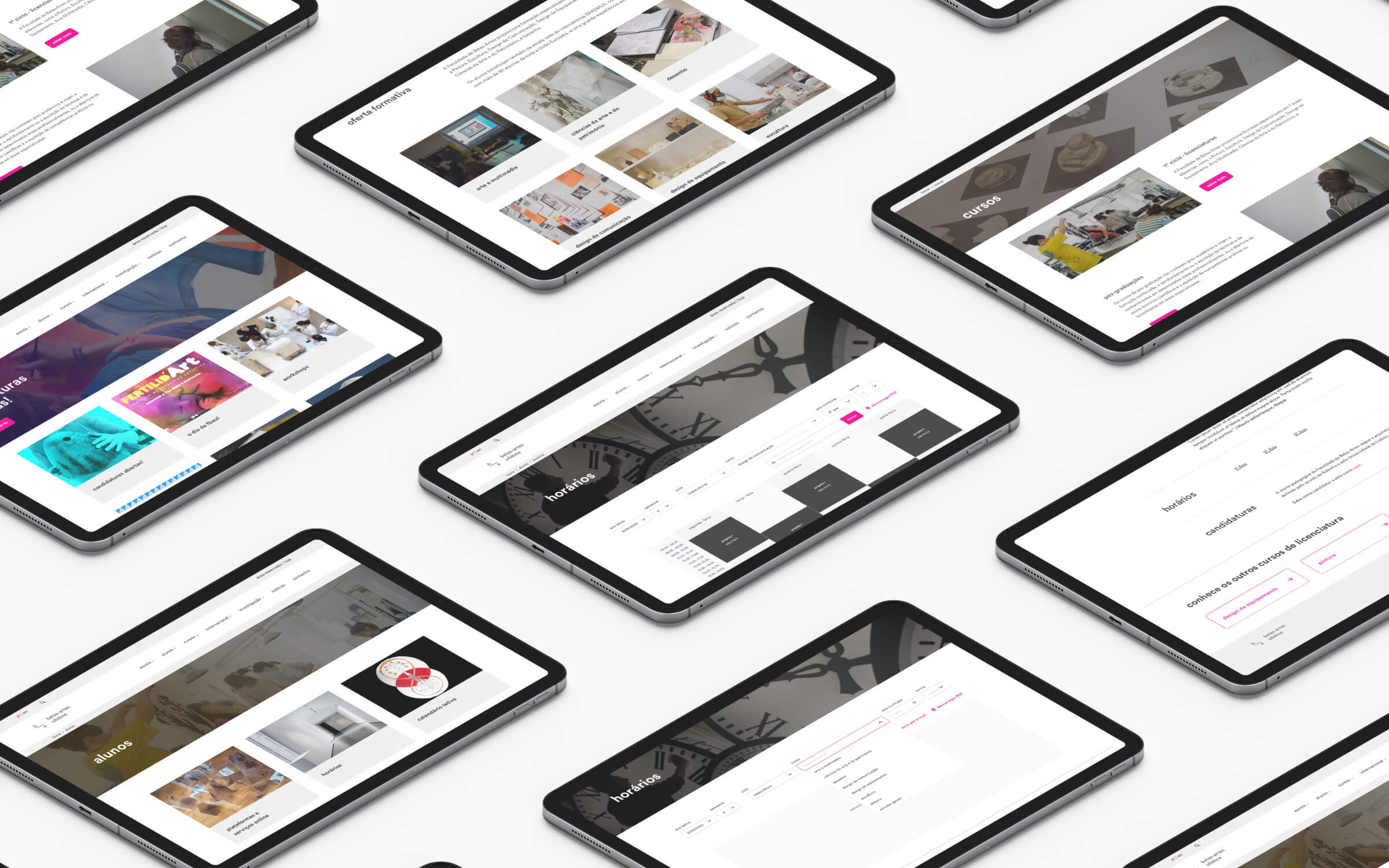
A modern academic platform concept that simplifies admissions, program browsing, and student guidance through clear navigation and structured flows.