Book a call

EatSafe is a concept mobile app designed to help users prevent, identify, and monitor food allergies and intolerances in real time. Designed as part of a UX/UI exploration project, its mission was to simplify how people identify risk foods, track reactions, and stay informed—before a crisis happens.
Built with a strong emphasis on clarity, accessibility, and prevention, EatSafe translates complex medical information into a calm, approachable daily tool. Through intuitive navigation and a reassuring visual system, it empowers users to feel safer and more confident in their food choices.
Food allergies and intolerances affect hundreds of millions of people worldwide. In Portugal alone, over 300,000 individuals* live with diagnosed conditions, and many more experience recurring symptoms without proper guidance. Survey data** revealed that 85% of respondents confuse allergies with intolerances, highlighting a major gap in public understanding and self-management.
Although information exists, it is scattered across manuals, forums, and medical websites — often overwhelming, inconsistent, or difficult to interpret. Users need a reliable way to understand risk foods, recognise symptoms, and manage their condition calmly and confidently.
*(data from 2018-2019)
**(data from 2020)
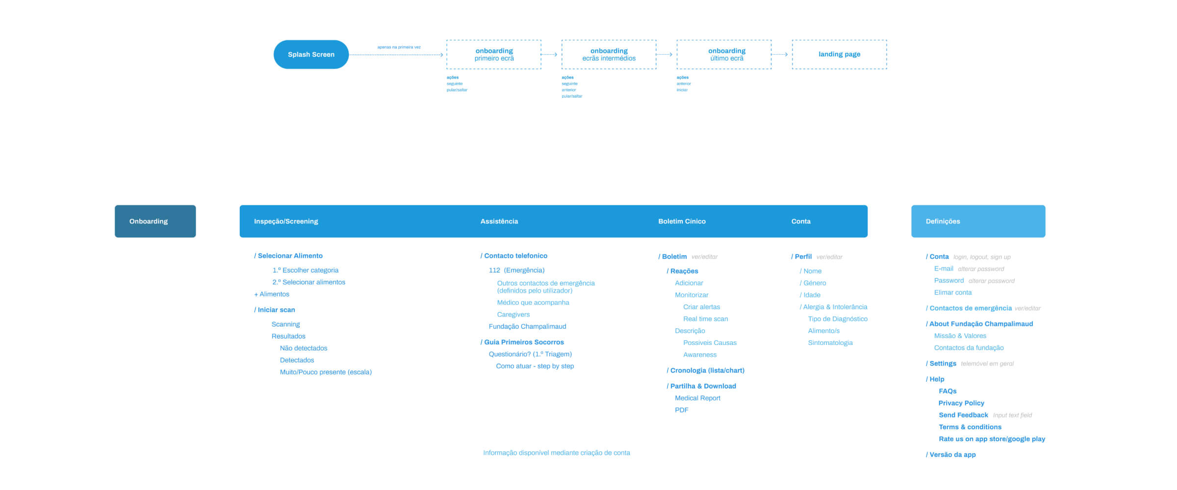
Our process began with a behavioural research phase combining surveys, digital behaviour analysis, and segmentation. Three target groups emerged: users with confirmed allergies or intolerances, users with recurring unexplained symptoms, and supportive profiles such as parents or caregivers.
Across all segments, common needs surfaced: clear definitions, quick access to trustworthy information, personalised prevention tools, and a calm digital environment that does not induce anxiety. Using affinity mapping and user flows, we defined core use cases and structured the app around simplicity, reassurance, and continuous learning.
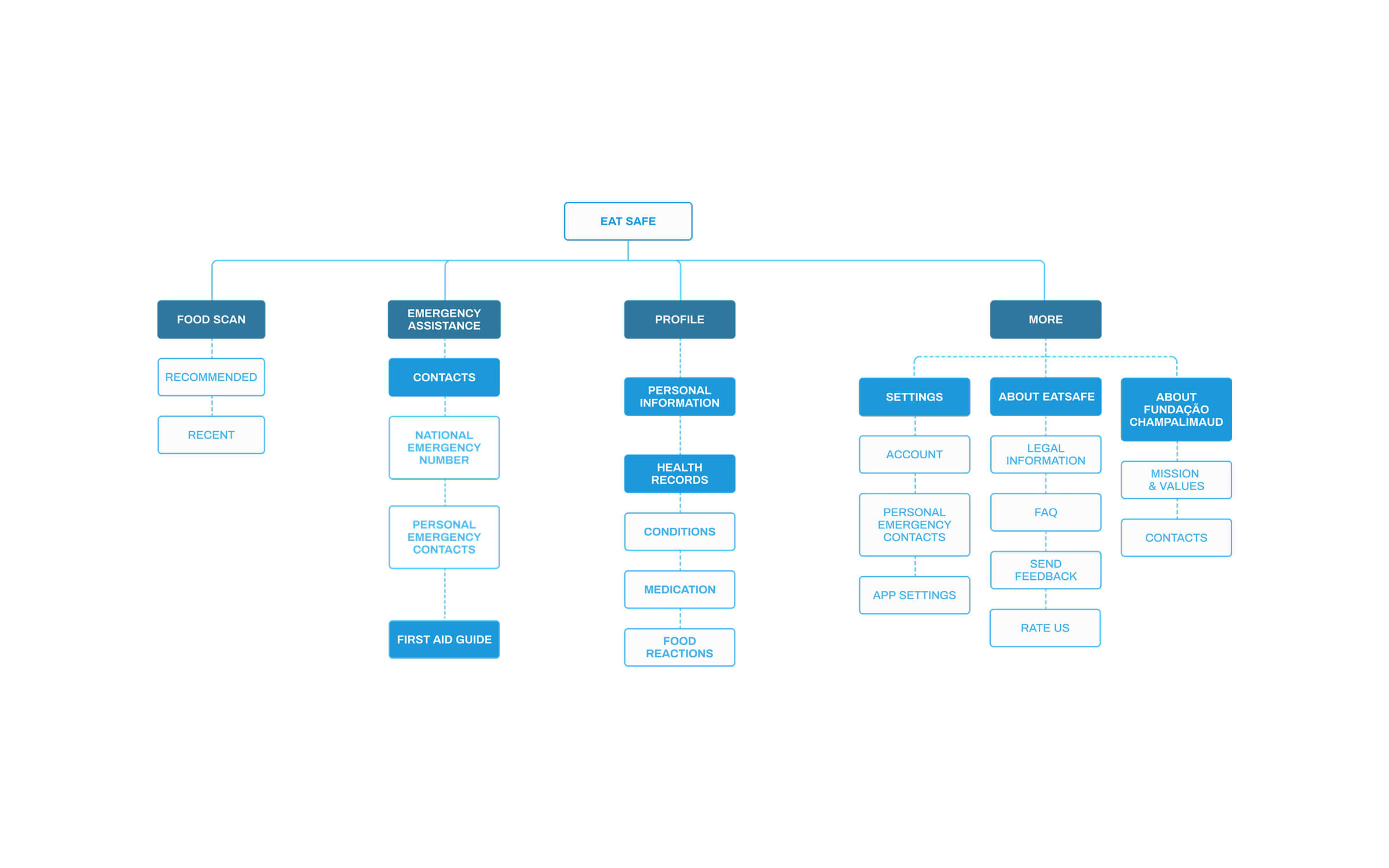
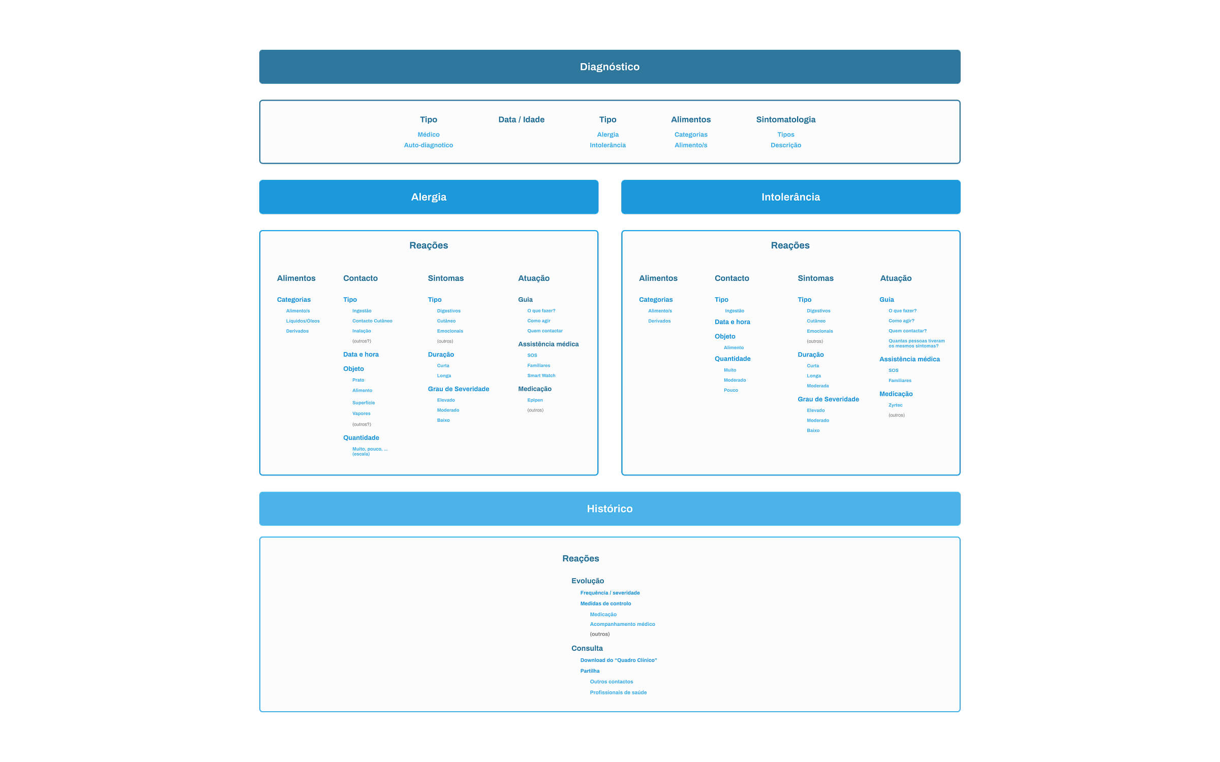
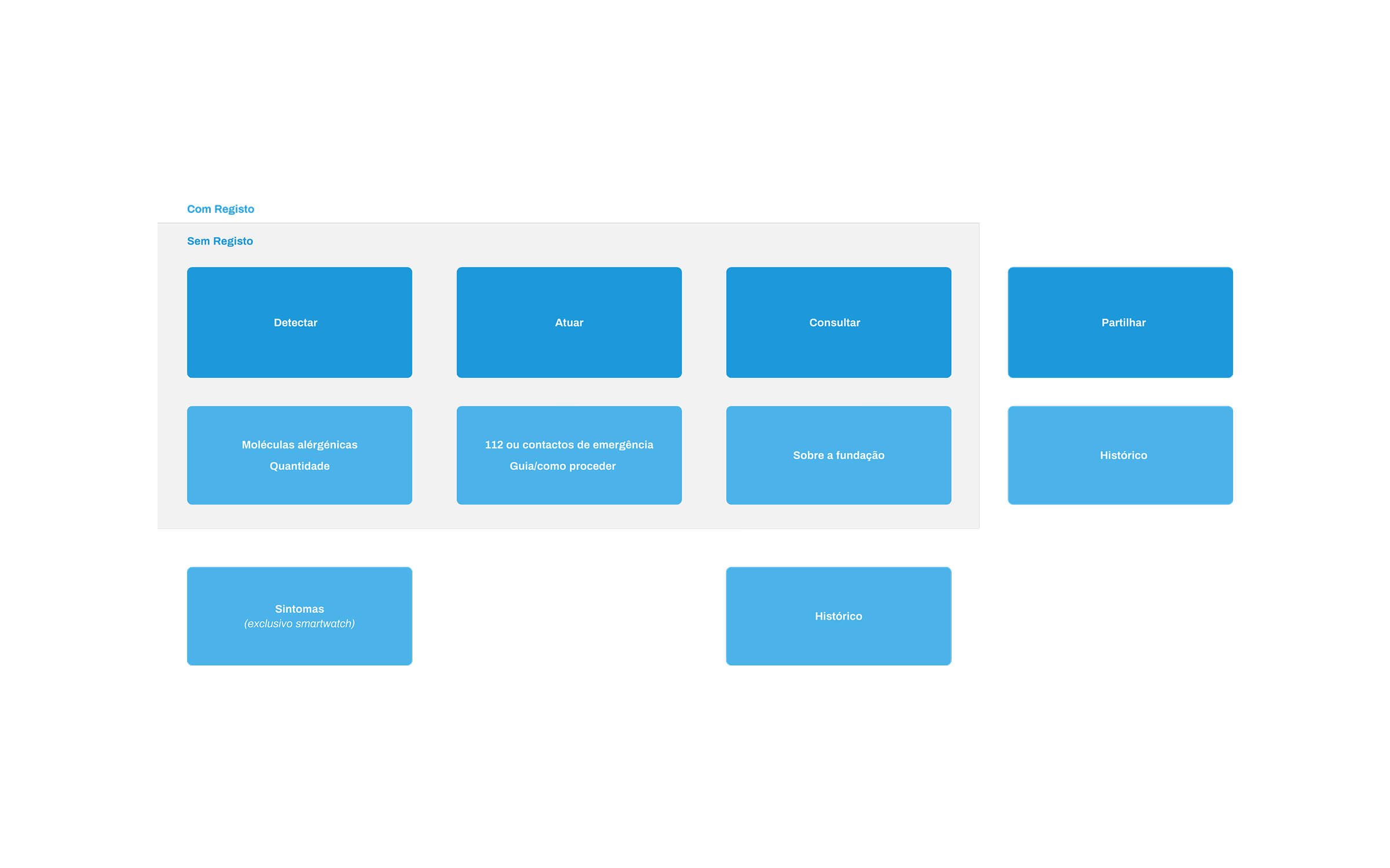
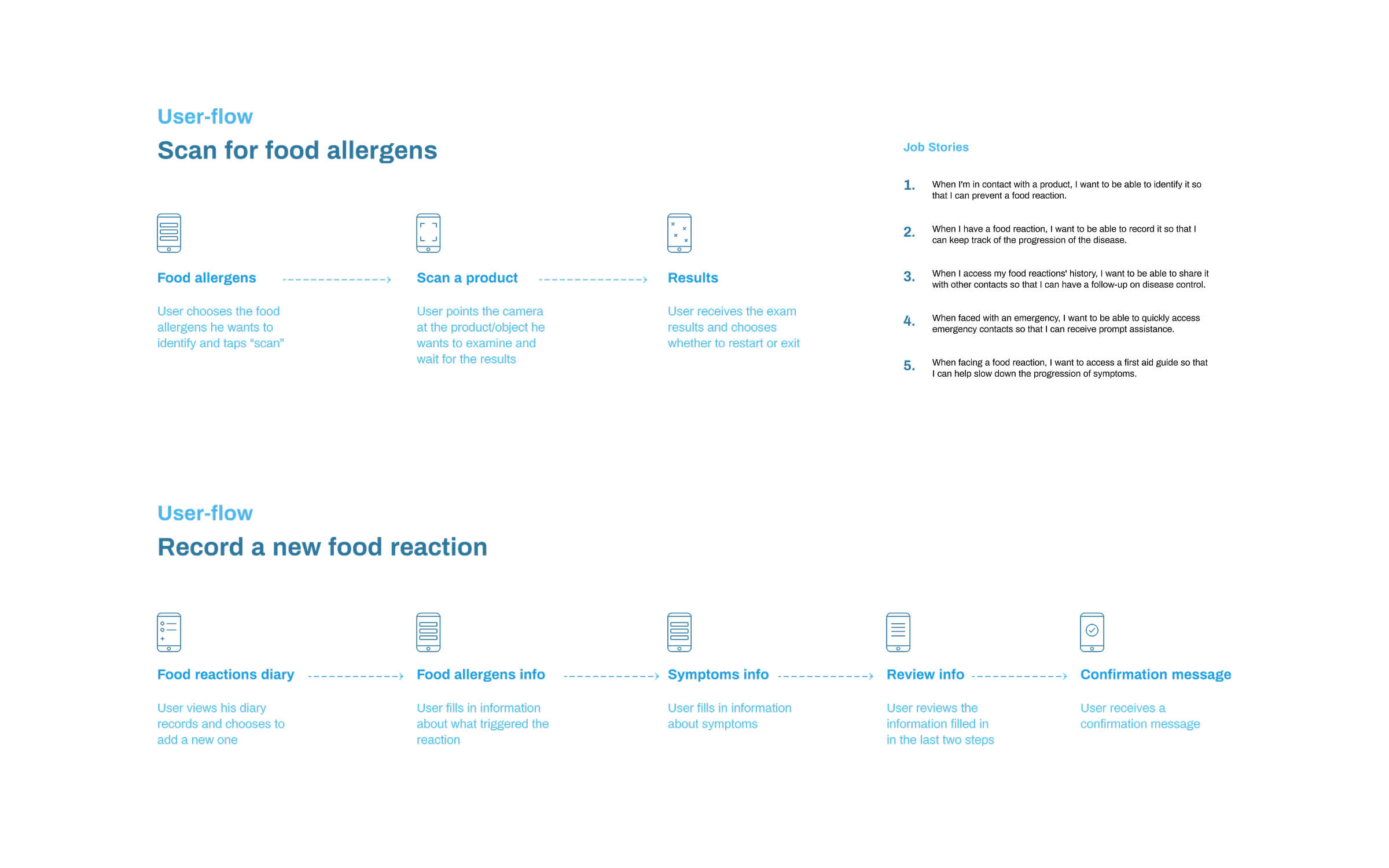
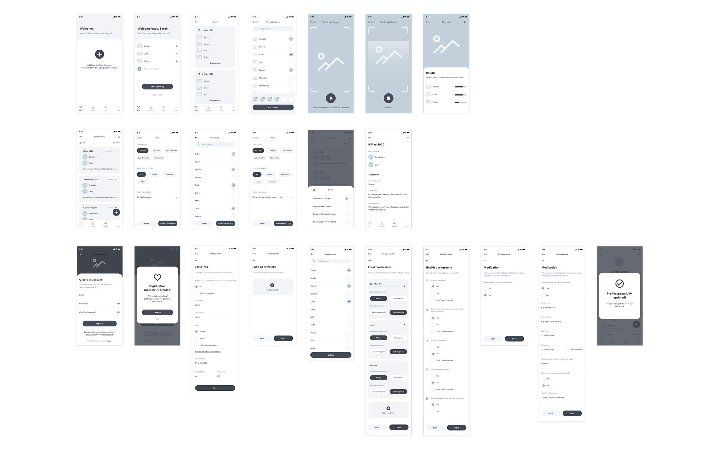
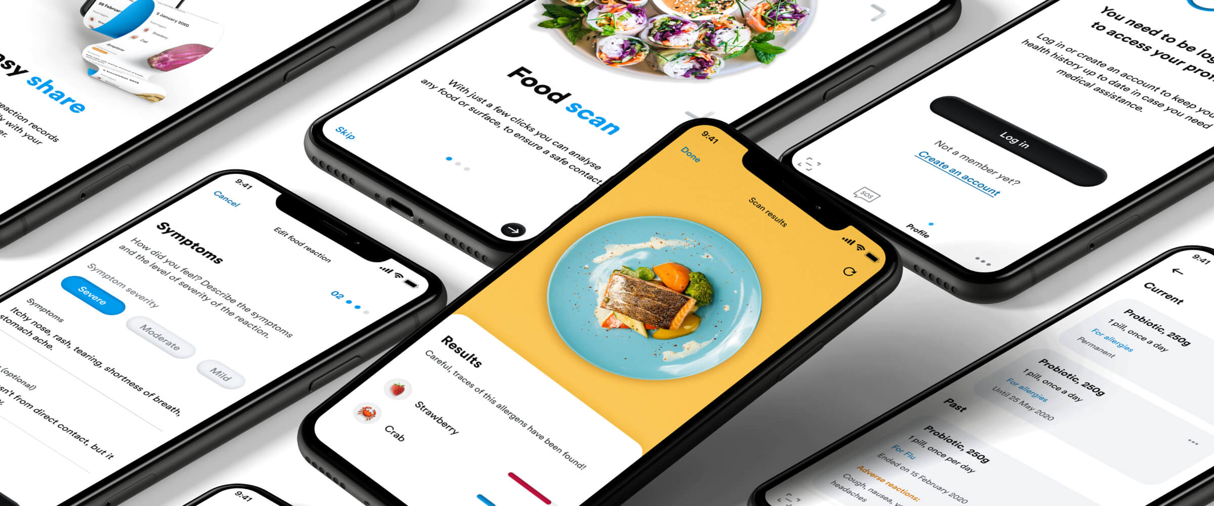
The EatSafe interface was designed around three main pillars: prevention, education, and empathy. The app helps users scan food products, record allergic reactions, and review their medical history—all in a structured, calming experience.
We created a flexible design system that blends clean geometry with soft color tones—using blues and whites for trust and clarity, paired with subtle gradients for depth. Typography followed accessibility principles for legibility and calm rhythm, ensuring comfort for long-term use.
Each flow—from scanning to emergency response—was carefully tested to minimize stress and friction. Icons, micro-interactions, and spacing were all refined to reflect the reassuring nature of medical guidance while remaining approachable and intuitive.
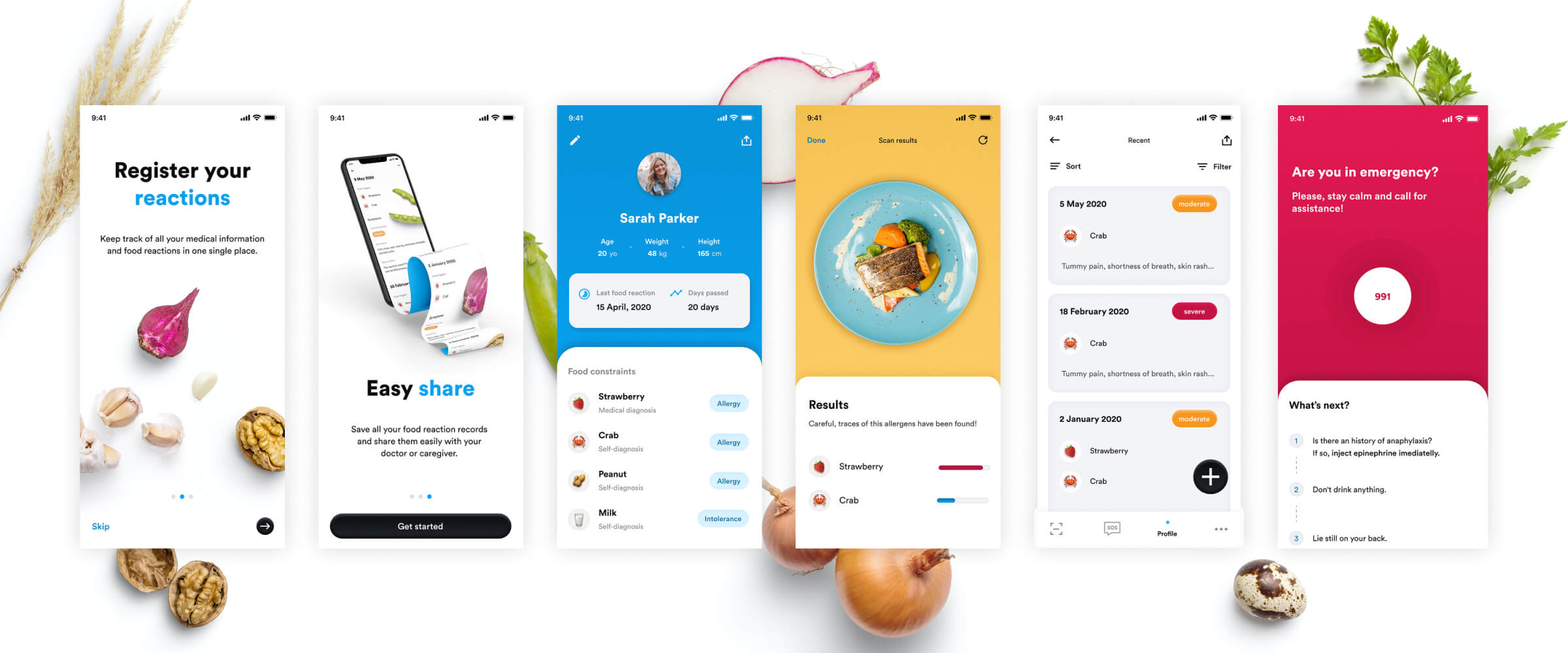

EatSafe demonstrated how thoughtful UX can transform a complex medical topic into a clear and reassuring daily tool. During review sessions, users praised the app’s tone of voice, visual calmness, and simplicity. They highlighted that the structure made it easier to understand their symptoms and distinguish between allergies and intolerances.
Research confirmed that users need emotional safety as much as functional accuracy. Clean interfaces, consistent patterns, and gentle pacing reduced anxiety and built trust. The project reinforced the value of designing health applications that educate without overwhelming — prioritising clarity, prevention, and confidence above all.
A bold sushi brand inspired by Japanese waves and street-style energy, built for high-impact packaging and social-first communication.
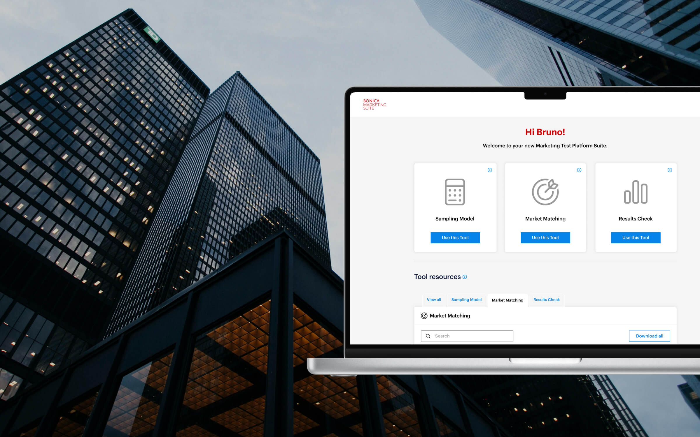
A suite of analytical tools redesigned into one structured experience — simplifying market tests, sample-size modelling, and results validation.