Book a call
This project focused on evaluating and improving the usability of the Faculdade de Belas-Artes da Universidade de Lisboa (FBAUL) website, with a specific focus on one critical experience: finding and consulting class schedules.
While the website offered complete academic information, its structure made essential tasks unnecessarily time-consuming. Students struggled with unclear hierarchy, inconsistent links, and fragmented navigation paths that led to duplicated or incorrectly grouped content.
Our goal was to reorganize the information architecture supporting this flow, refining navigation and page structure so students could find schedules quickly and confidently — all without altering the existing visual identity.

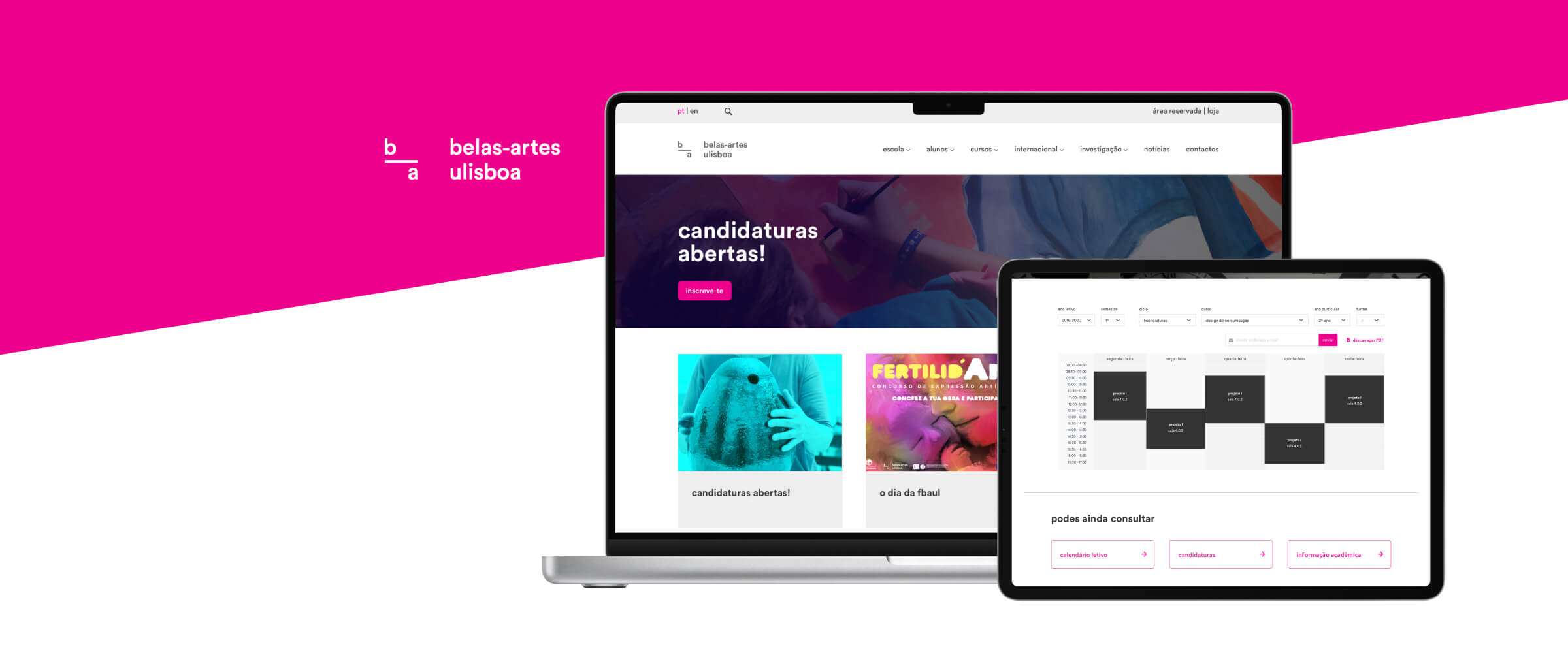
Although visually appealing, the FBAUL website made essential academic tasks unnecessarily complex. Students struggled to locate class schedules due to inconsistent hierarchy, scattered links, unclear labels and pages that grouped unrelated information together.
Content often appeared duplicated, hidden inside deep submenu paths, or behind PDFs without clear indication. This created a frustrating navigation experience, forcing many students to rely on external search or email instead of the website.
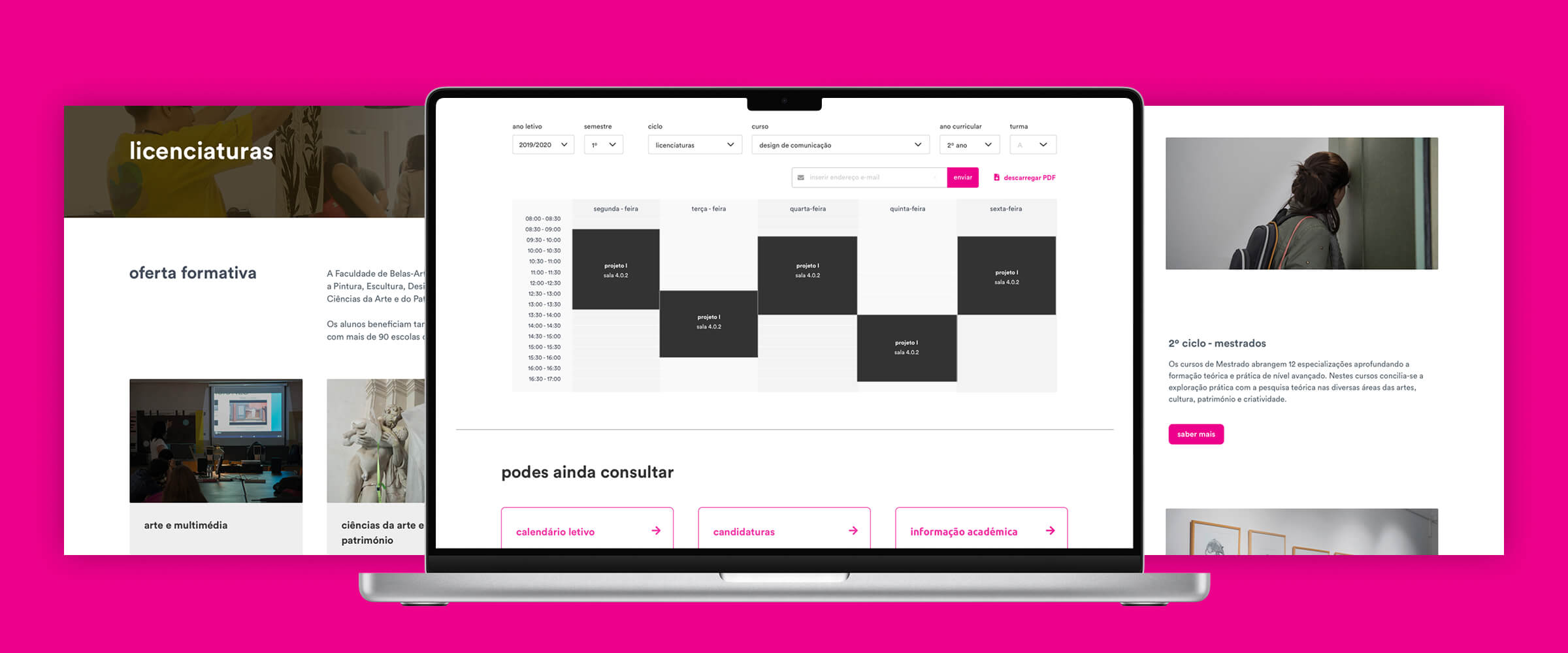
The challenge was to simplify this critical flow — reorganizing the information architecture and navigation logic so that class schedules could be found quickly, consistently, and without guesswork.
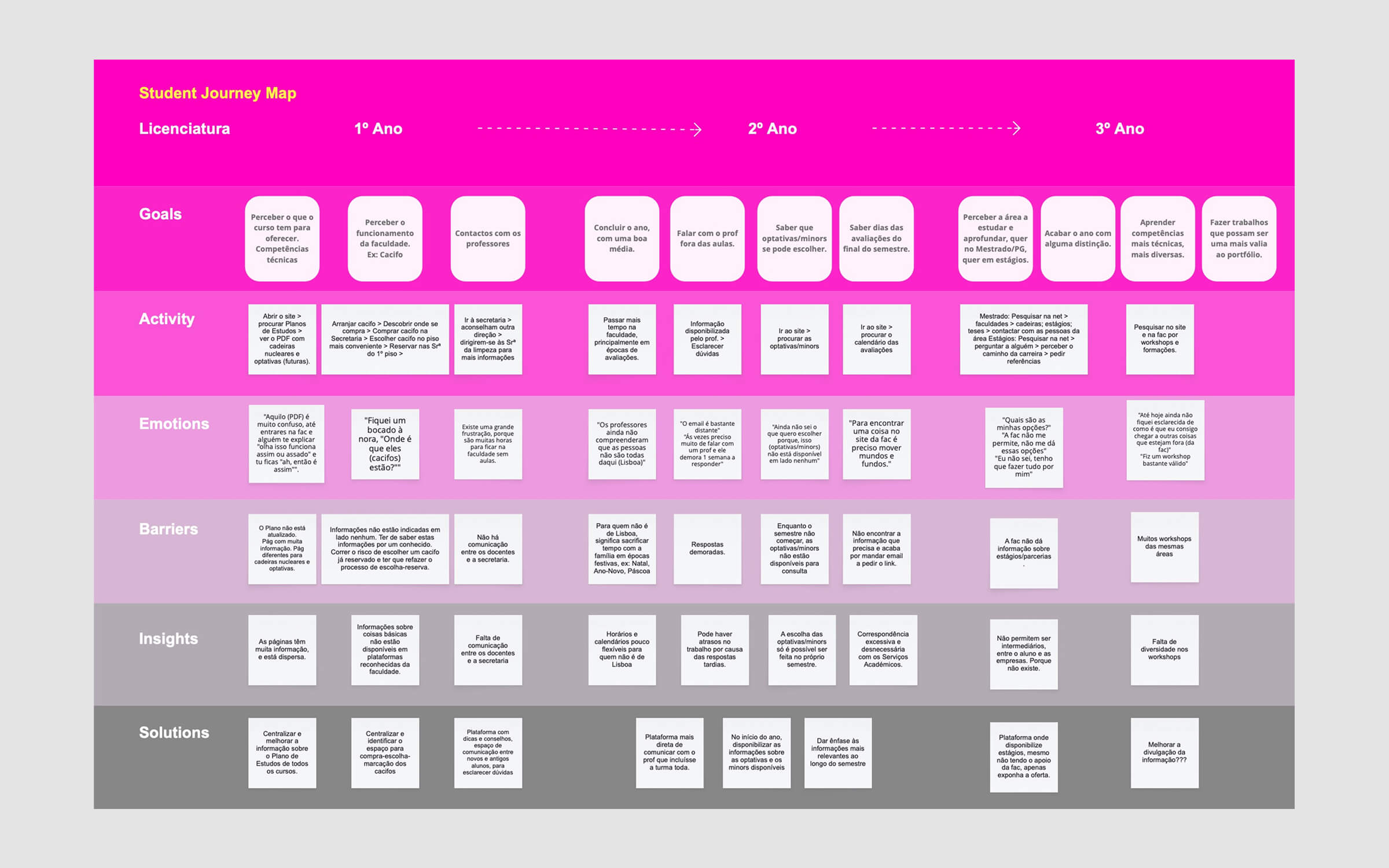
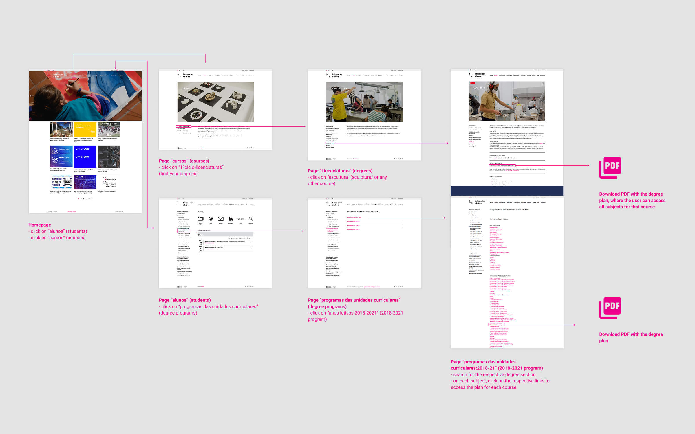
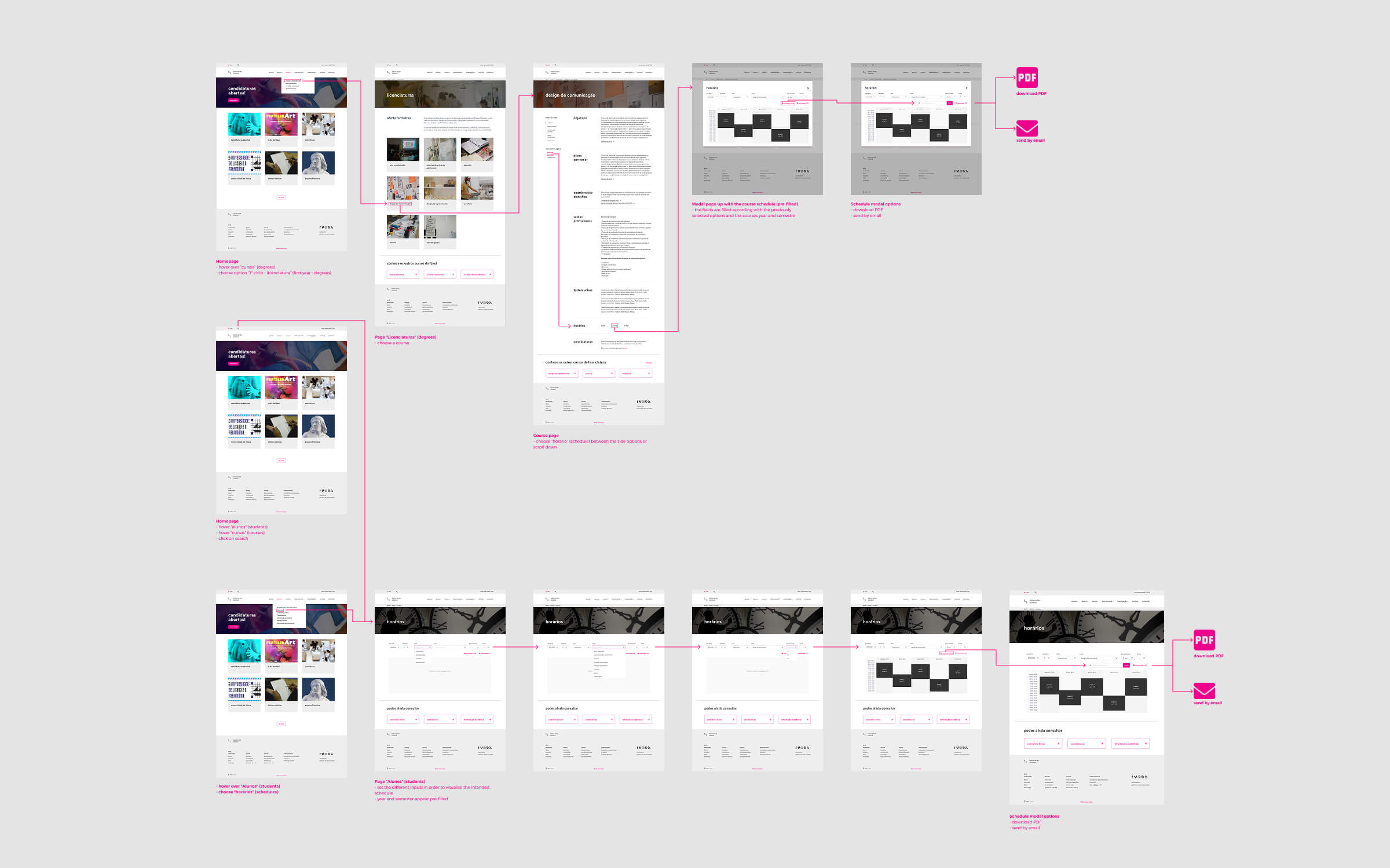
We began by analysing the existing structure around schedule-related content, mapping how students attempted to reach “Horários” from different entry points. This included a full review of menus, submenus, breadcrumb trails and page relationships.
To understand behaviours and expectations, we conducted surveys and short interviews with FBAUL students, identifying how they currently accessed schedules and where they encountered friction. We also benchmarked 14 national and international university websites to understand best practices in academic information architecture.
Using affinity mapping and journey mapping, we identified the most intuitive navigation paths and reorganised the architecture around them. This led to a clear, simplified flow centered on two predictable starting points: Cursos and Alunos.
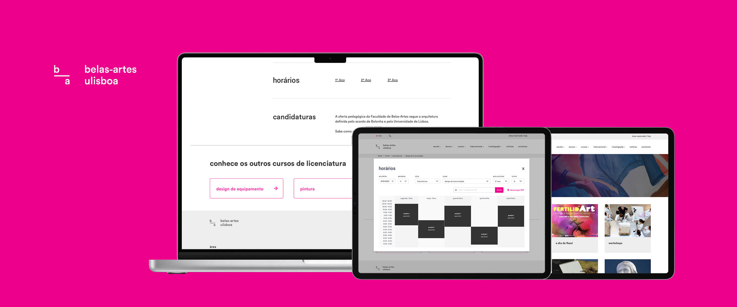
The redesign focused on usability and information clarity rather than visual overhaul. The core improvements included:
Wireframes and prototypes were developed and tested in InVision, prioritizing navigation flow, visibility of primary actions, and a clearer reading rhythm. Each element was validated through iterative feedback loops with real students.

Usability testing validated the effectiveness of the redesigned flow. All participants successfully completed the task of finding their class schedule, resulting in a 100% completion rate and a 100% error-free rate.
Two natural navigation behaviours emerged: 60% of users entered through Cursos, while 40% used Alunos. Both paths functioned intuitively, confirming that the new structure supports multiple valid entry points without creating confusion.
Students described the new layout as “logical,” “clean,” and “much easier to follow,” especially praising the clarity of the reorganised course pages and the visibility of the new “Horários” section.
Participants quickly understood the simplified menus, the restructured course pages, and the section indexes. They relied on familiar patterns—like clicking the logo to return home—showing that the redesign maintained intuitive behaviour while removing unnecessary complexity.
Overall, the project demonstrated how targeted adjustments to information architecture can dramatically improve usability. By aligning navigation with real student behaviour, we transformed a confusing flow into a clear, predictable and student-centred experience.
A refined visual identity inspired by craftsmanship and natural materials — elevating a construction and architecture brand with a modern, premium look.
A redesigned property search experience focused on clarity, faster decision-making, and intuitive location tools — helping users find the right home with less friction.
