Book a call
MortgageFlow is a US-based mortgage technology platform designed for underwriters, loan officers, and mortgage analysts who work with complex borrower data. The system centralizes credit, income, assets, and documentation flows, consolidating what is traditionally a fragmented and compliance-heavy process.
When we joined the project, the platform already had an early interface and a partial design system. Our mission was to create clear information architecture, unify the UX across all modules, and design scalable patterns that could support the evolving complexity of mortgage evaluation.

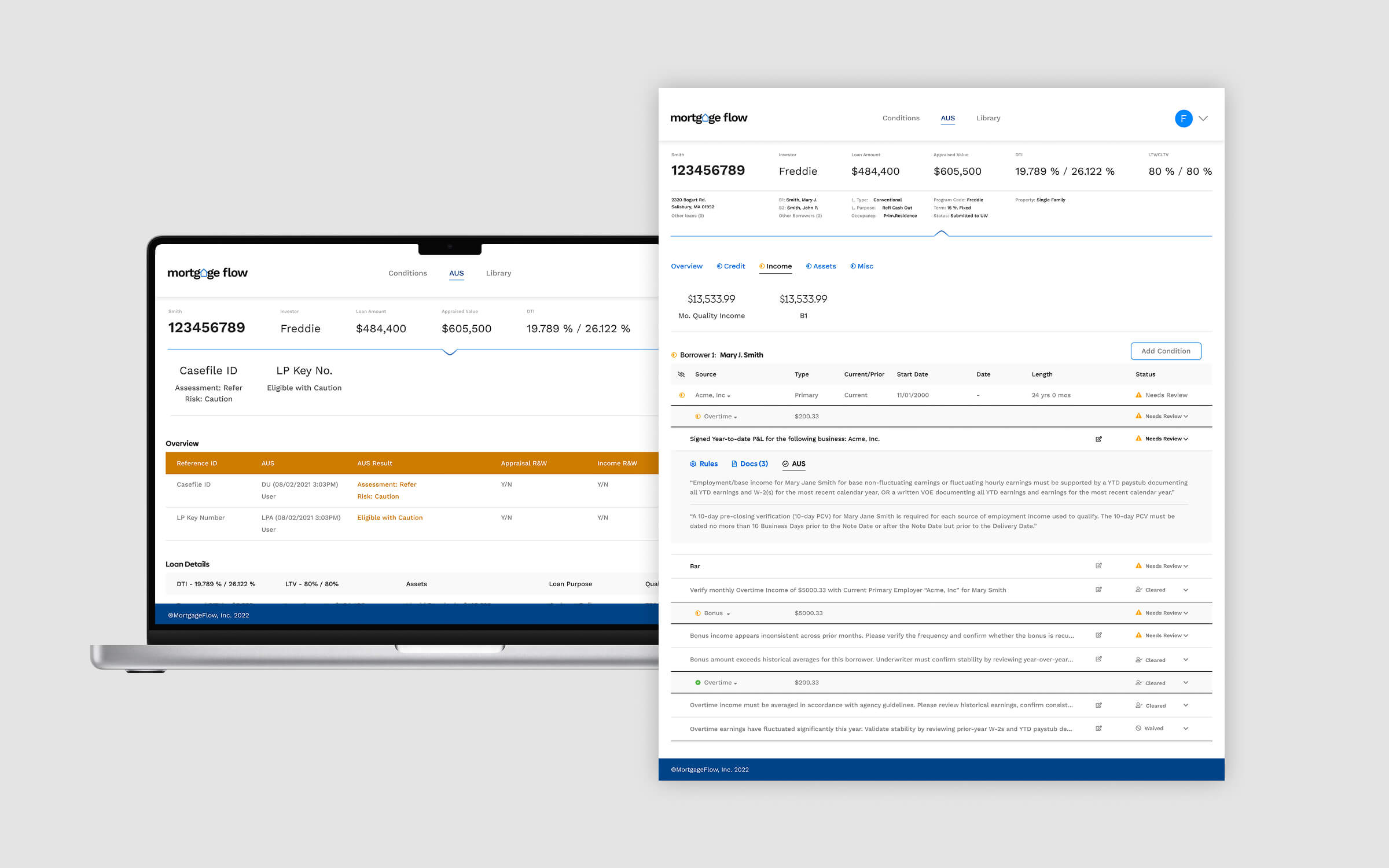
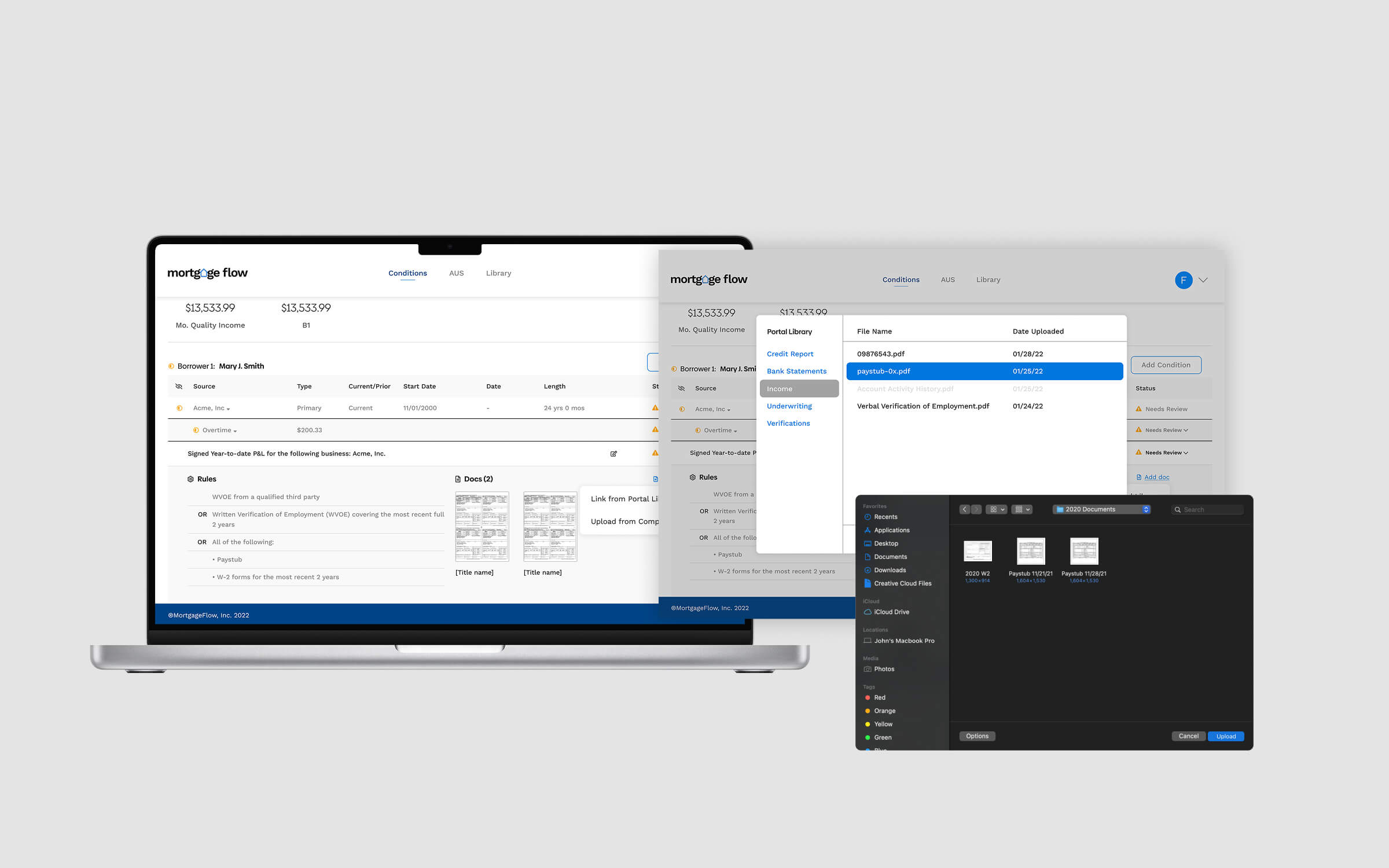
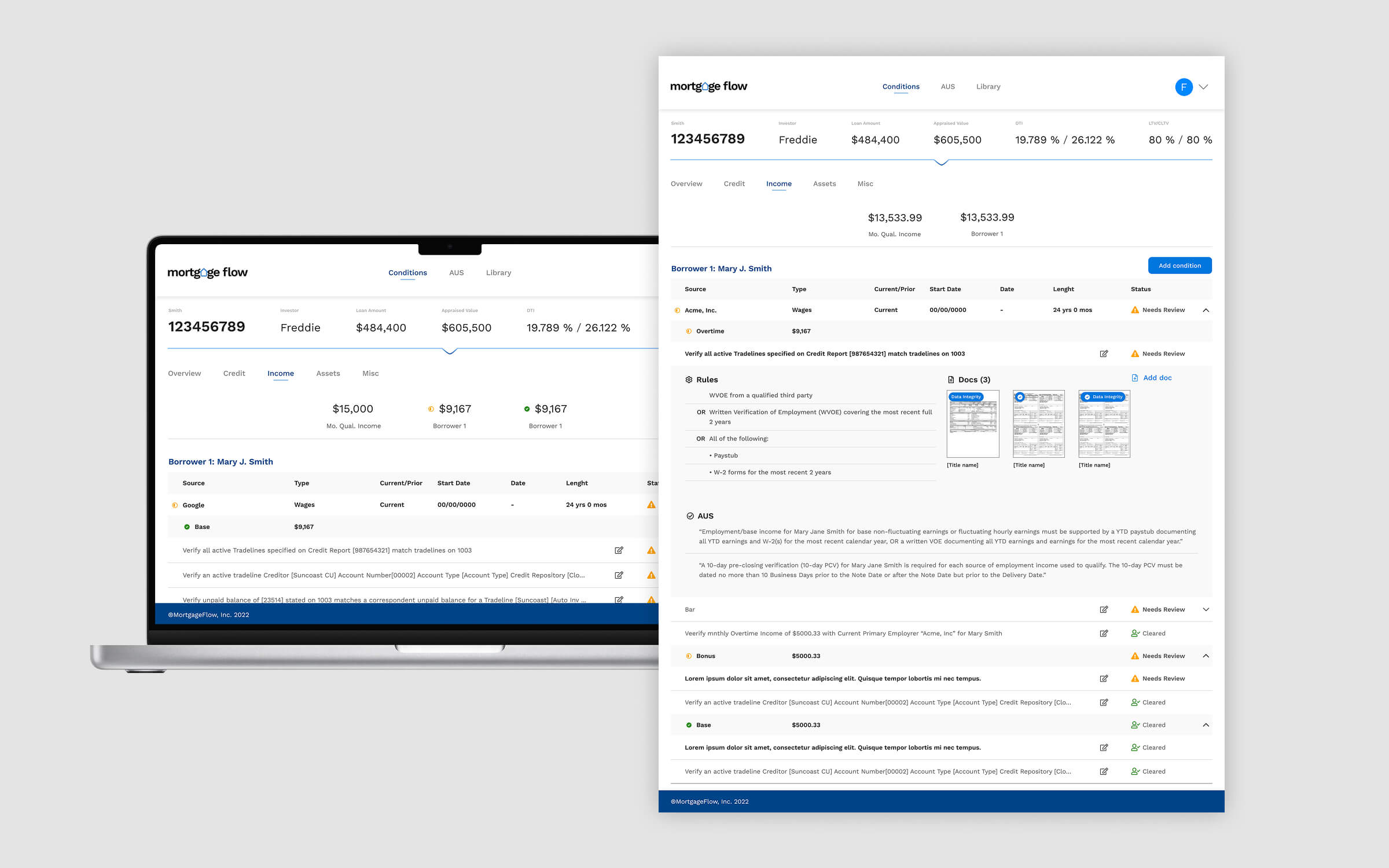
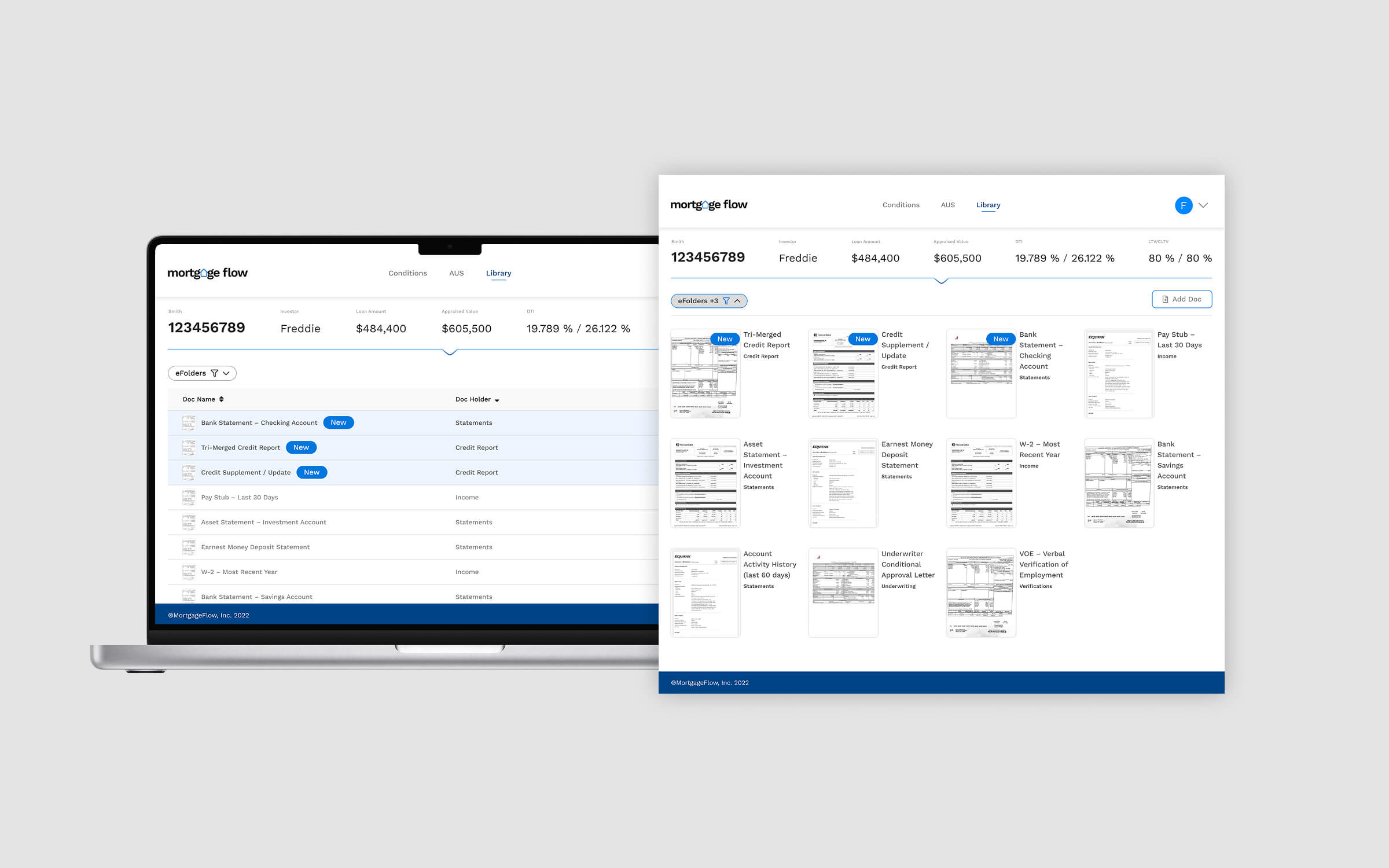
US mortgage workflows are uniquely demanding, involving strict compliance rules, multiple verification layers, and dense financial data. The platform had to display liabilities, credit conditions, borrower documents, employment records, AUS findings, and more — all while remaining usable for analysts who spend hours inside the product.
The early product suffered from inconsistent layouts, unclear hierarchy, and patterns that did not scale once real borrowers with large data sets were tested. Complex tables, expandable content, and document linking flows were overwhelming and slowed users down during evaluations.
We began by analysing every existing screen shared by the client, mapping how information was currently organised and identifying friction points. There were no workshops or external research — the redesign was grounded entirely in the material provided: platform screenshots, feature breakdowns, and client feedback.
From there, we proposed a cleaner navigation structure, reorganised the information architecture, and applied a cohesive UI language that respected the client’s existing design system while modernising it for clarity and scalability. Each redesign decision was validated directly with the client in asynchronous reviews.
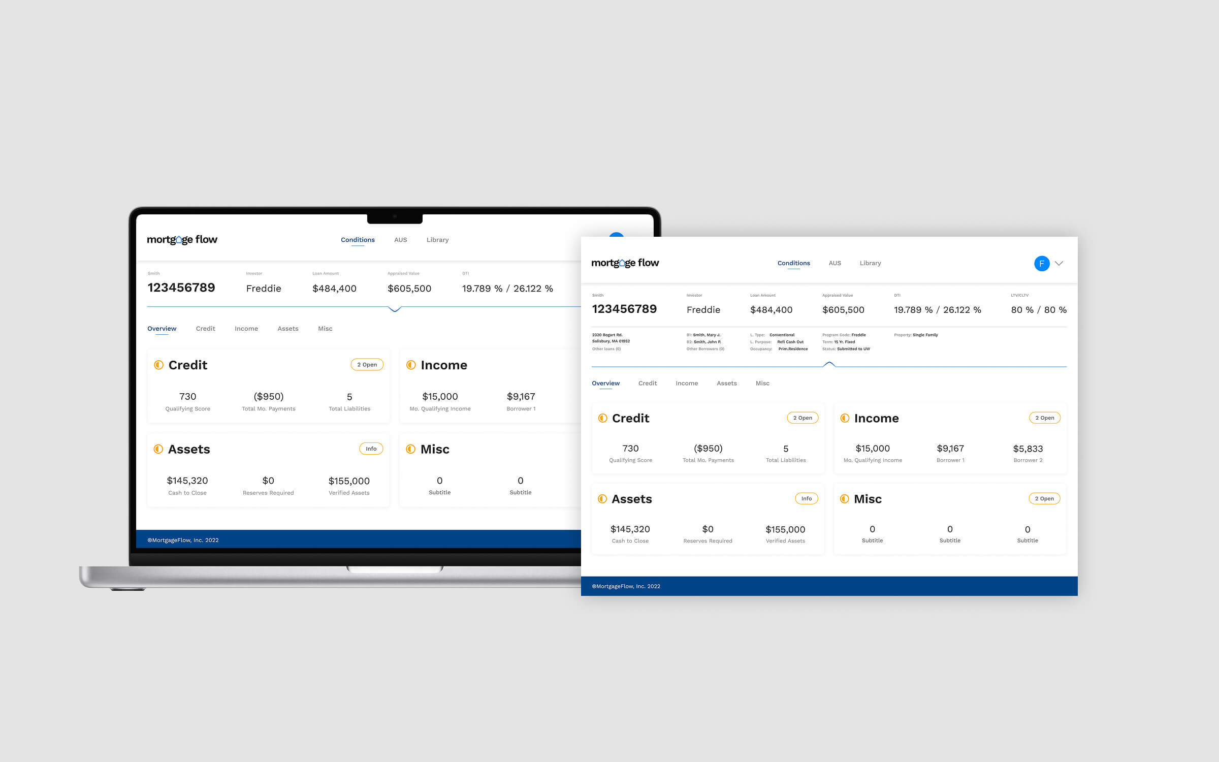
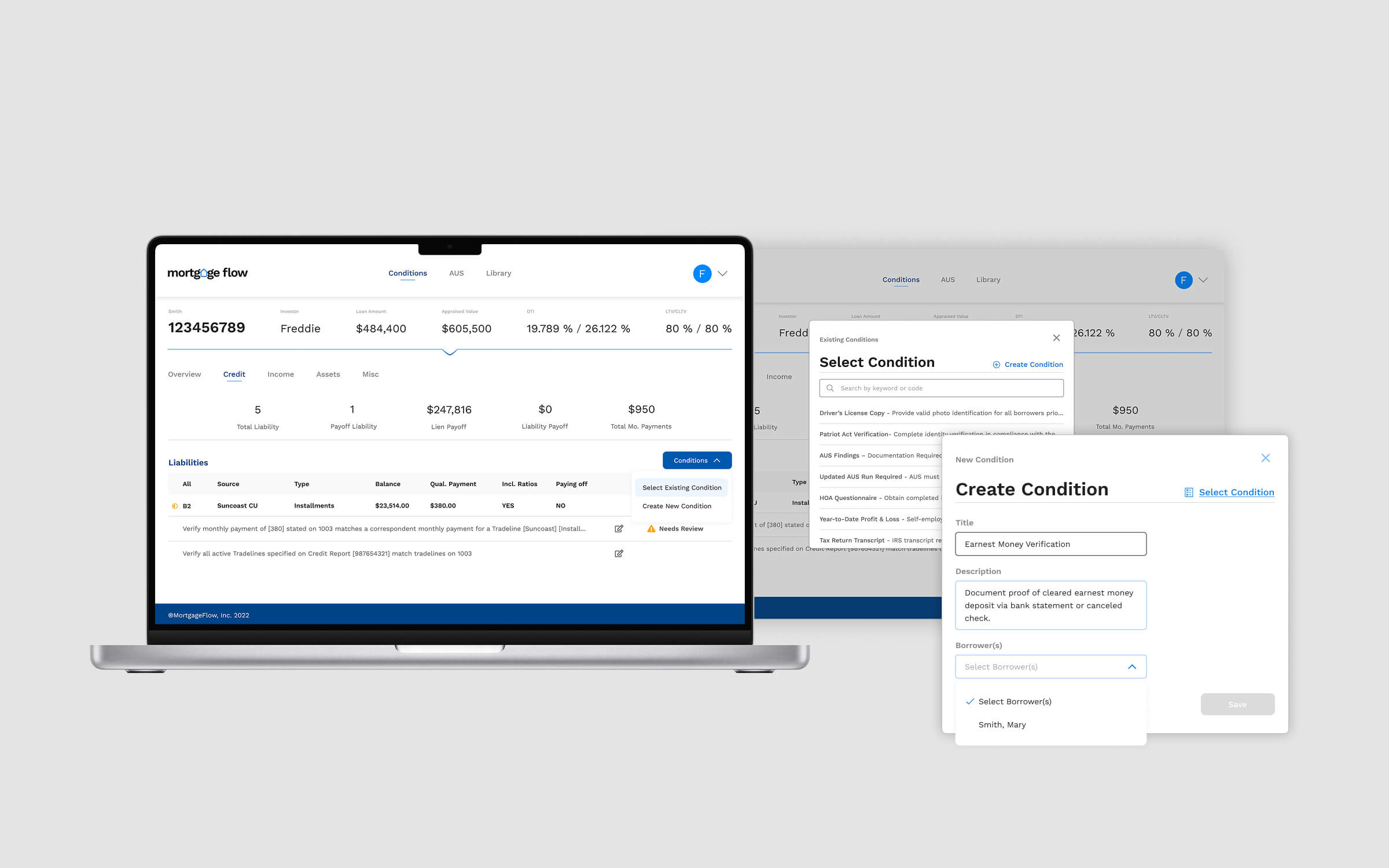
The redesign focused on providing a clearer, more structured workflow across mortgage stages — from borrower intake and loan setup to document review and status updates. We introduced layout consistency, improved spacing, refined hierarchy, and aligned typography and colour usage across key modules.
Complex screens were reorganised into digestible sections, making it easier for loan officers to review borrower data and for processors to track progress. We also helped unify UI patterns such as tabs, tables, modals, alerts, and progress indicators so the product felt cohesive instead of fragmented.
The redesigned interface gave MortgageFlow a more intuitive, professional, and scalable foundation. Teams could navigate the product faster, understand borrower stages more clearly, and operate with fewer visual distractions and inconsistencies.
The new structure also made it easier for engineering to implement future features without adding UI chaos, since patterns and spacing rules were now standardised.
This project highlighted the importance of visual coherence in data-heavy platforms. A structured review of the product’s existing interface can reveal clear opportunities for simplification and clarity.
The improvements also showed the client the value of maintaining a consistent design system — turning the redesign into a foundation they could continue building upon internally.

A CRM and call-queue platform for investment brokers, built to streamline workflows, improve lead prioritisation, and give managers real-time visibility.
An MVP for creators to test, compare, and validate content before publishing — gathering structured feedback to improve storytelling and engagement.